Anyone reading the news or talking to just about anyone else, will quickly realise that whenever talk turns to climate change, the greenhouse effect, and global warming, the main thing, actually almost the only thing, that comes up is CO2. But it is not the only gas that poses a danger and contributes to the problem.
I believe it is quite a good idea to see a little bit of the historical data which can help us to understand how much fast-growing population and human activity is directly connected with global warming.
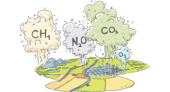
But first, a short reminder about the greenhouse effect. Our atmosphere is made up different types of gases including carbon dioxide, ozone, methane, nitrous oxide, and fluorinated gases.
One of their functions is to absorb and trap heat. This greenhouse effect raises the temperature and is one of the things that allows us to have comfortable living conditions on this planet.
The big problem here is that the gases in the atmosphere need to be in balance, and right now levels of certain gases are rising, and rising fast. Overly high levels of greenhouse gases trap too much heat in our atmosphere and cause negative effects on the planet because the air, ground and oceans are getting too warm.
I want to share some charts that will help you to easily see the rise of the gases in the atmosphere and the temperature on our planet. In my opinion sometimes it can be hard to understand just from reading a load of numbers but maybe the rising lines will help to make it clear.
If we were to ask the question: how much of the warming can be attributed to human emissions? Probably the only real answer would be all of it. This quote from The Intergovernmental Panel on Climate Change (IPCC) says it all:
“Anthropogenic greenhouse gas emissions have increased since the pre-industrial era, driven largely by economic and population growth, and are now higher than ever. This has led to atmospheric concentrations of carbon dioxide, methane and nitrous oxide that are unprecedented in at least the last 800,000 years. Their effects, together with those of other anthropogenic drivers, have been detected throughout the climate system and are extremely likely to have been the dominant cause of the observed warming since the mid-20th century.“
Let's start out by looking at the rising global temperature from 1850 to the present day.

In the next image you can see the data on how methane levels have increased from 1850 up to the present day. In short, in 1900 the level of CH4 was 54% lower than now, in 1950 41% less than now, and in 2010 it was lower by 5% than it is now. It shows that the level is possible to control, but we don't need to just keep the number stable, but to actively reduce it.

Let’s look at Carbon dioxide as we talk about it the most. This rise is also clear to see in the next chart.

In 1900 the level of CO2 was 29% lower, in 1950 25% lower, and was 6 percent lower in 2010. It is interesting to note that each May there is a big increase in CO2 emissions. Tim Lueker, research scientist, explains why atmospheric CO2 peaks in May:
"Spring comes to Siberia. There is a much larger amount of land in the Northern Hemisphere, particularly with huge forested areas in Siberia, while the Southern Hemisphere is dominated by ocean, but because of the slow mixing, even if there were as much land in the south, the Mauna Loa cycle wouldn’t look very different. Also, while photosynthesis in the ocean is also extremely important to atmospheric chemistry (phytoplankton being responsible for the air we breathe today), this marine photosynthesis does not drive the annual peak in atmospheric CO2 because little of the CO2 goes into the atmosphere."
While it is not going up as drastically as the others, the levels of nitrous oxide is also rising.

Today it is 17% higher than in 1900, and 4% higher than in 2010, as you can see in the above chart with data from 1850 onwards. Of course, it has a few little dips downward and was stable for some years, but overall it doesn’t stop rising.
One more gas I would like to mention is oxygen.
We don’t really talk about it, but did you know that while the level of greenhouse gases are jumping up the oxygen level is dropping down. You don’t need to get into a panic it is going down very slowly and doesn’t have an effect on human health, but it is an interesting fact. The oxygen is leaving our atmosphere. Is is connected with increasing temperature and the levels of other gases?
The Scripps O2 Program is based at the Scripps Institution of Oceanography in La Jolla, California and under the direction of Professor Ralph Keeling. It is measuring changes in atmospheric oxygen levels, and analysing samples from around the world. Below you can see the data from 1990 up to this day.

Numbers can tell us a lot, charts can support them and we can make our conclusions. Looking on the bright side of these charts, if you can see one of course, it is clear that we need to make radical changes in human activity - transportation, manufacturing, agriculture, our use of fossil fuels, lifestyles, and in too many other areas to list.
We need to find urgent solutions to reduce all of these gas emissions. Scientists and governments worldwide are working on proposals, making climate models and creating international agreements, like the Paris accord, let’s hope that they are enough to prevent the ultimate climate disaster.
We first published this article in the Platforma EKO newsletter Towards Sustainability: Issue 9 - March 2021.
